What is a dashboard?
A dashboard, in dbMap/Web, is a collection of relevant summaries about a given topic, such as wells or prospects. It allows you to see, at a glance, a comprehensive set of relevant information on all registered entries related to the topic you are examining.
On the screen, a dashboard is a set of charts, tables and maps. The picture below is an extract of a dashboard on wells.
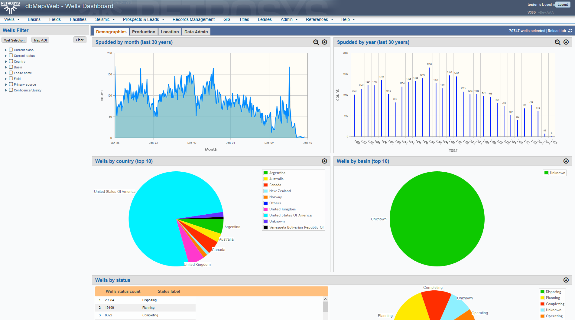
Although apparently complex, dashboards are fairly easy to build, requiring no programming skills and a limited knowledge of HTML, the “language” used to define all web pages.
Dashboards general features
All dashboards have a set of standard features and capabilities.
The master counter

This shows you how many “base” entries are being considered in all dashboard panes. In this case, one well is one “base” entry. It’s worth pointing out that one “base” entry may produce more than one piece of information in some cases: a well, for instance, may be represented by more than one point on a map.
The tabs

Tabs are used to group information and increase clarity. The number of tabs in a dashboard is arbitrary, and it’s up to the users and the designers to define which ones will be needed.
A “reload tab” icon is always displayed at the top right corner. This allows you to “refresh” the view of a tab, if it should become garbled or distorted for some reason.
The master filter
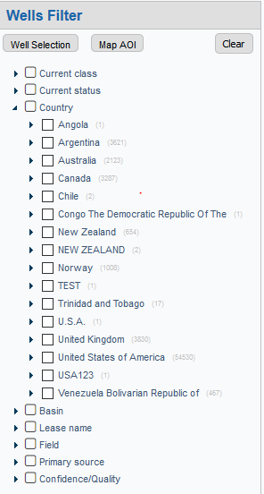 |
You can filter relevant entries using any combination of criteria available in the “tree like” frame usually located on the left side. This filter will always be visible and available to you, even if you scroll the dashboard down. You must keep in mind, however, a set o simple rules governing this filter tool:
More details on how to use filters are given below. |
The main panel
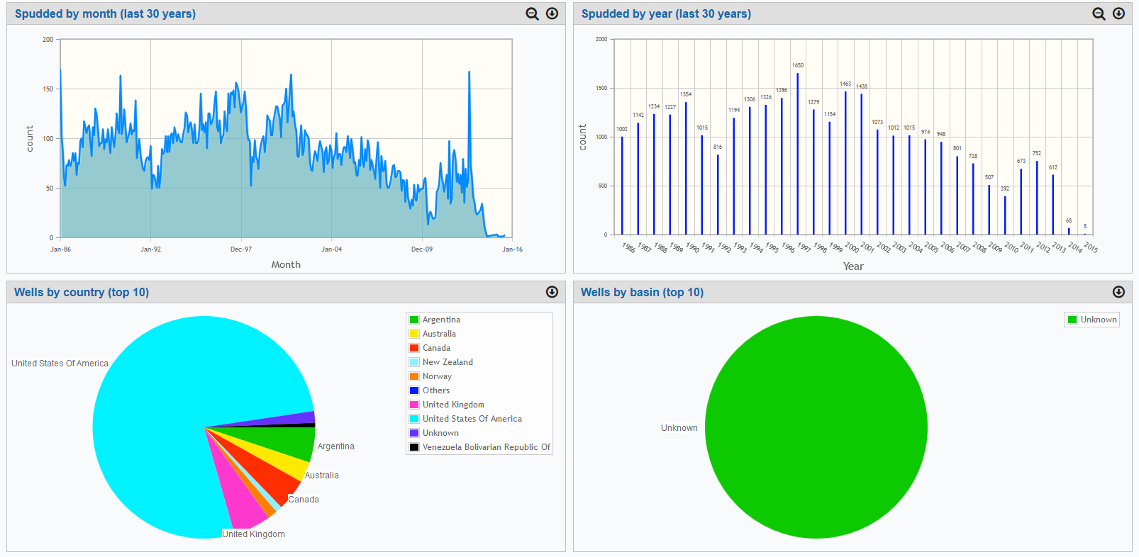
The main panel shows you the results you’re interested in. Results produced depend on your filter criteria and the tab you’re looking at.
Applying filters
You have many filtering options available in the master filter. The most intuitive one is the tree filter, subject to the rules mentioned above.
The tree filter
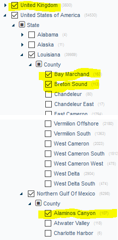 |
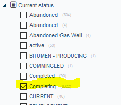
The tree filter is hierarchical, but only the very top branches produce combination criteria. If you select the entries shown on the left, you will get wells located in the United Kingdom (country) OR in the counties of Bay Marchand, Brenton Sound or Alaminos Canyon, the first 2 in Louisiana and the 3rd in the Northern Gulf of Mexico, all three in the United States. You get this because all conditions are from the same TOP branch (Country). This produces 10,404 wells, as shown below.  Adding to this the current status “completing”, however, brings this number down to only 1,442, because “current status” is another TOP branch and the criteria are, then, combined, that is: enforced together and at the same time.
|
Additional criteria buttons
Above the tree filter, you may, depending on the dashboard, have a set of additional criteria buttons: the selection button (Well Selection, in this example) and the Area of Interest (Map AOI) button.
The selection button allows you to use the dbMap/Web “cross reference” feature to select entries (wells, in our example case). This means that you can nominate a previously saved list of entries, or entries you have just selected using the main screen related to your dashboard’s main subject (wells, in our example) as criteria. When you press the selection button, you will see a screen like the one below.
You will be able to choose whether the currently selected entries or a previously saved list is to be used and, in the latter case, select which stored list to use.
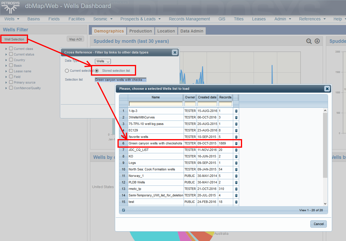
If you confirm all the selections, you will notice that the selection button will display a blue border. This is just a visual indication, letting you know that a “cross reference” criterion is in place.

The area of interest (Map AOI) button, when present, allows you to select entries based on a polygon you draw on a map. It selects all entries inside that polygon.
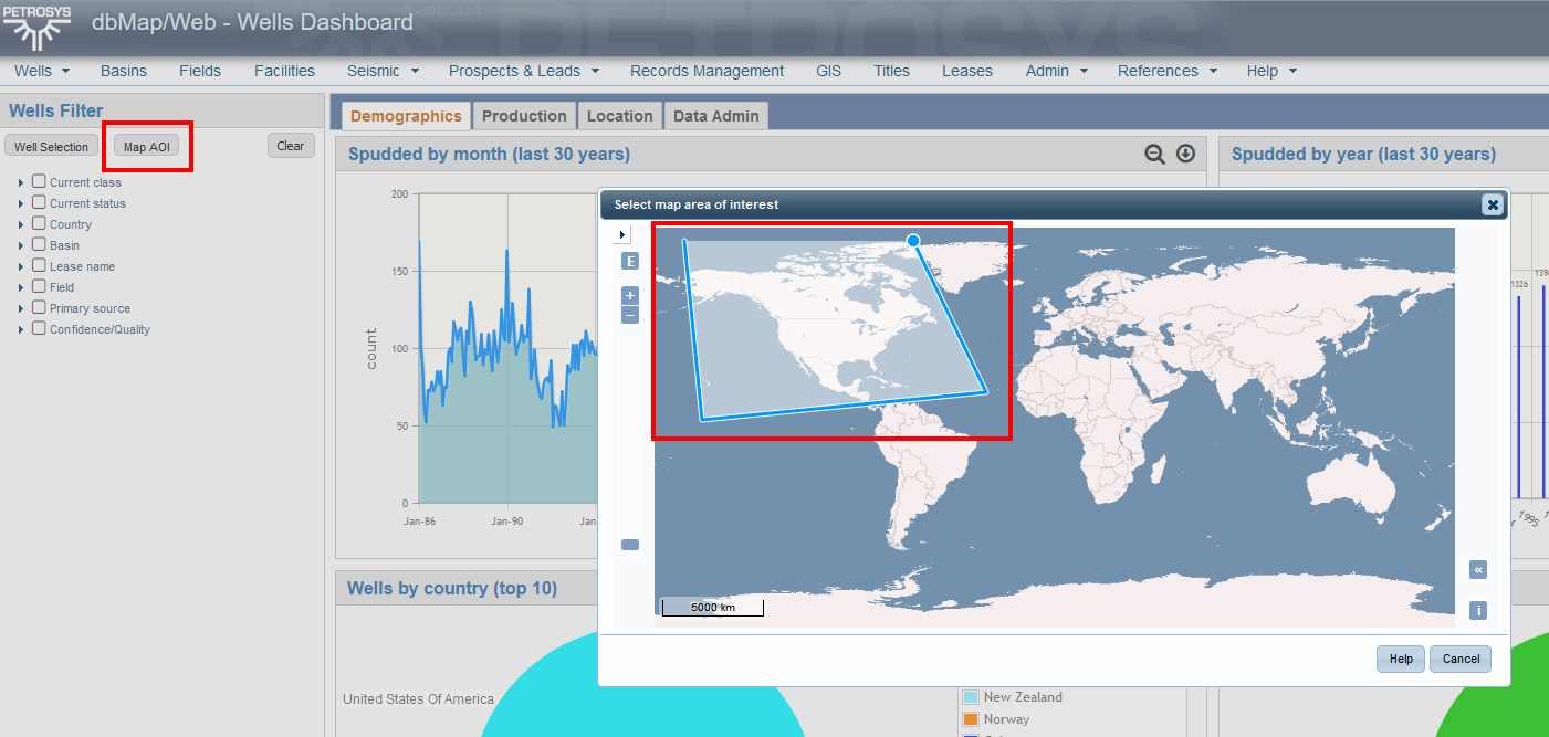
Similarly, when you confirm your selection, the Map AOI button is displayed with a blue border, to let you know that a map based area of interest criterion is in place.
As said, these buttons, when present, are TOP branch equivalents: their criteria will always be combined to any tree filter entries you may have selected. If you select a map polygon, for instance, entries will have to be inside that polygon and, at the same time, match all criteria selected via the tree filter.
Finally, you have the CLEAR button, usually located at the top right corner of the master filter section. This button, when pressed, will clear all criteria entered.
Currently, the clear button is the only way of clearing Map AOI or selection button criteria. These buttons, when used, cannot be individually “unmarked”.
Chart panes
Chart panes can display a variety of chart types. All chart types can be “downloaded” as an image, via the download icon, located at the top right corner of the corresponding pane.
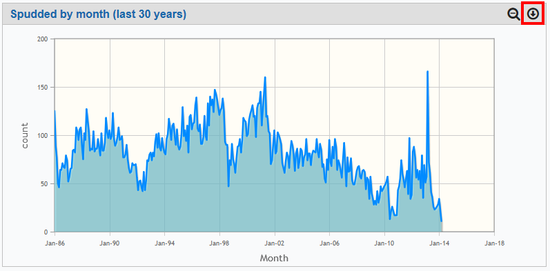
Besides, some charts are “zoomable”. If they are, the pane will also have a “magnifying glass” icon at the top right, so that you can “reset” the zoom level if you want.
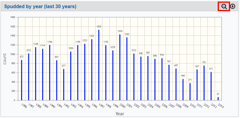
To “zoom in” a chart, just draw a rectangle inside it. The area you choose will be expanded into a “zoomed” chart, and you are free to keep on doing this over and over, if so wanted.
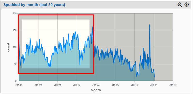
(zoomed in chart)
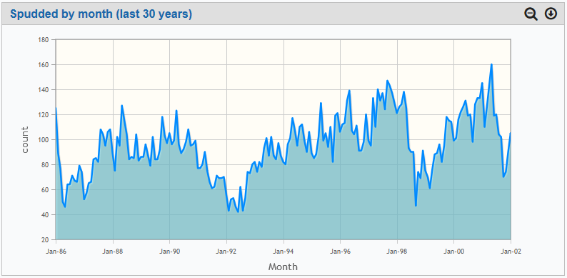
The reset zoom button will restore the chart’s original aspect.
List panes
List panes may or may not be accompanied by a corresponding chart. If they are, together they constitute what we call a “hybrid pane”, such as the one below.

The list panes have a few elements and controls that are worth describing.
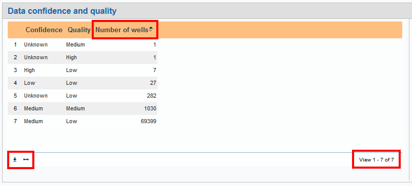
At the bottom right corner of each list pane, you will notice a paging indicator, containing the total number of records in the pane and which records you are seeing right now.
The bottom left corner contains 2 iconic buttons:
The “down arrow” button allows you to download the contents of the list as a MS-EXCEL file, a CSV (comma separated values) file or a TSV (tab separated values) file. All three types are readable by MS-EXCEL; so, if this is your intention, the actual format chosen will make no difference. CSV and TSV files, however, are readable by a number of other software products. If you’re not a MS-EXCEL user, they might be interesting to you.
The double edged horizontal arrow will simply resize the columns in a way that all titles and column contents are guaranteed to fit in. You may want to use this one if some columns appear to be truncated or missing characters. You can use this as many times as you like.
Finally, as a rule, the column headers can be clicked to change the record order. If you click one of them, the table will be re-ordered and an indicator will appear to the right of the column name in order to show you if the new order is ascending or descending. The first click will trigger an ascending order; a second click will change ascending to descending; and so on.
Map panes
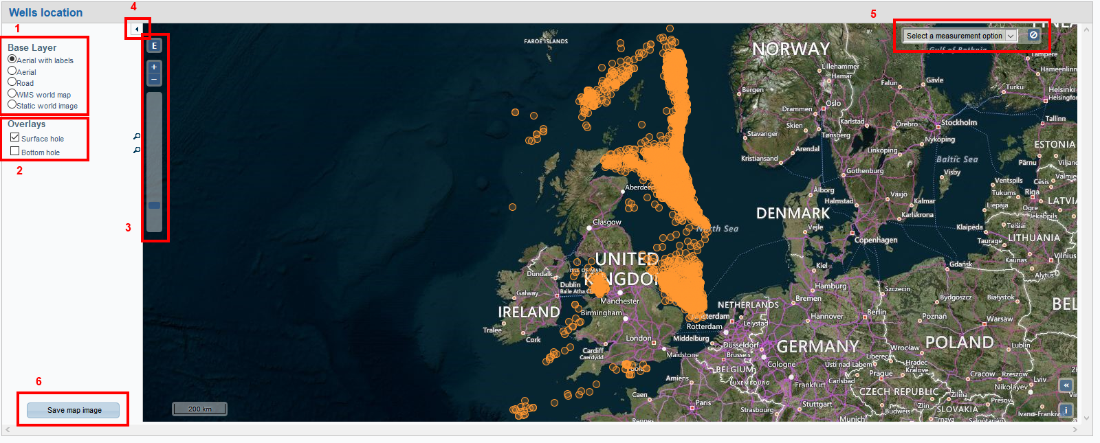
Some dashboards may have one map pane, showing the selected entries on a map. The actual map appearance may vary, depending on which base maps you have, but the general aspect will be as shown below.
You can control a number of map pane features via the standard map buttons and options:
You can choose the base layer to show. The base layers available to you depend on the map support your installation has. The example below displays the “Aerial with labels” base layer, but any of the others is valid, too (1).
You can choose which overlay layers to display. These may vary with the dashboard’s main subject and the kind of map support you have. In the case of wells, you will have, at least, the surface hole and the bottom hole overlays. Of course, if you “un-click” all of them, only the base map will be displayed (2).
You can zoom the map in or out (3).
You can hide or show the options pane (the pane to the left of the actual map) (4).
You can use the measurement tool to measure distances or areas on the map, based on lines or polygons you draw (5).
You can also save the map as an image and download this image to your computer (6).
But there’s more to maps! If you click on a point, you’ll get a details pane, showing more information about what is there (in this case, a well).
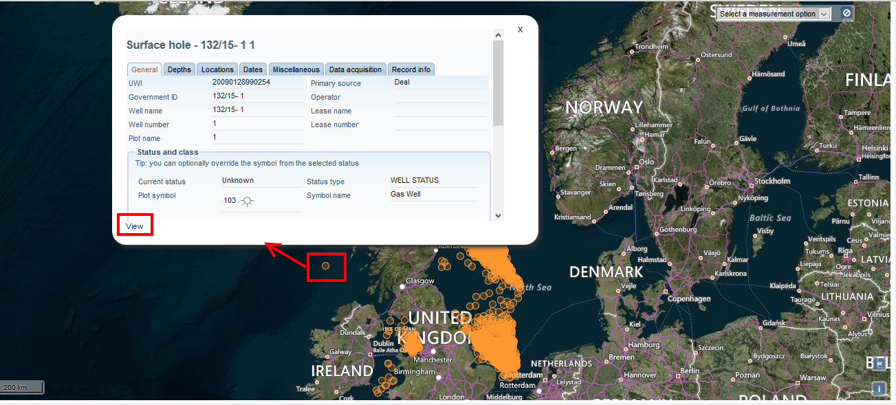
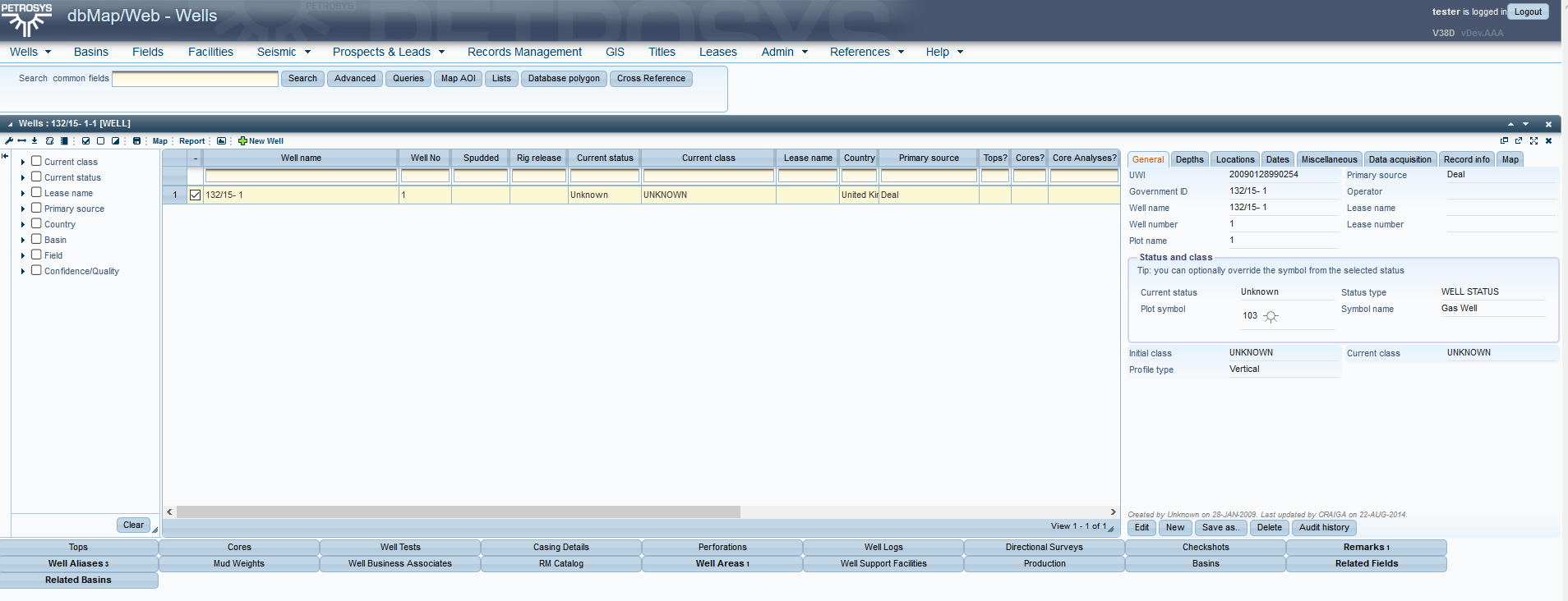
And the “view” link will take you directly to the corresponding complete details page, from which everything is available, including subordinate objects and relationships.
Support
Contact support@petrosys.com.au
